I haven’t posted lately about any updates I have been working on in regard to my open source application performance monitoring tool call AppPerf. I have been trying to get some time here and there to work on and improve it and add new features that would be useful. I am happy to say that I finally added a new chart on the overview page that should hopefully make it easier to identify when you are having an issue in regards to the performance of your application. I got the inspiration while reading about query bands on the VidixCortex site. Coincidentally, I have decided to call this new visualization, Latency Bands, as they are measuring the latency across different percentiles of data.
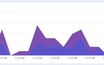
Previously, I was using two separate graphs to represent what I think I am able to show in one graph. I also think its much easier to identify when an issue has risen. First I will show what was previously being displayed on the page:
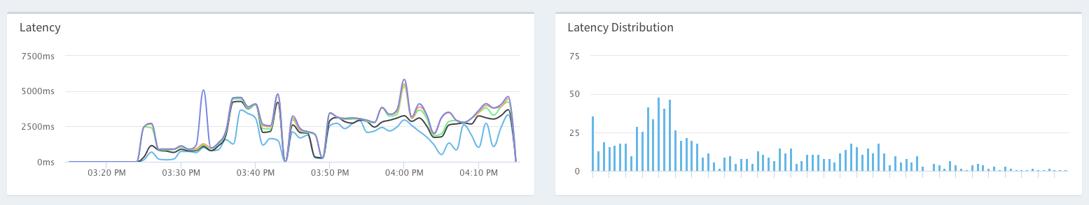
As you can see, I was showing a Latency and Latency distribution chart. The Latency chart was showing 50, 75, 90, and 95th percentiles. Likewise, the distribution graph was showing, well the distribution of requests across all 100 percentiles. At first glance, its hard to tell what is actually going on here, and with AppPerf, I want to make is extremely easy and quick to say, “Hey, I see a problem.”. Also, while these particular percentiles are helpful, what about the 95th and up percentiles that you are missing. Those are also important. We don’t know if the 100th is 5000ms,50,000ms, or even more. Not that helpful.
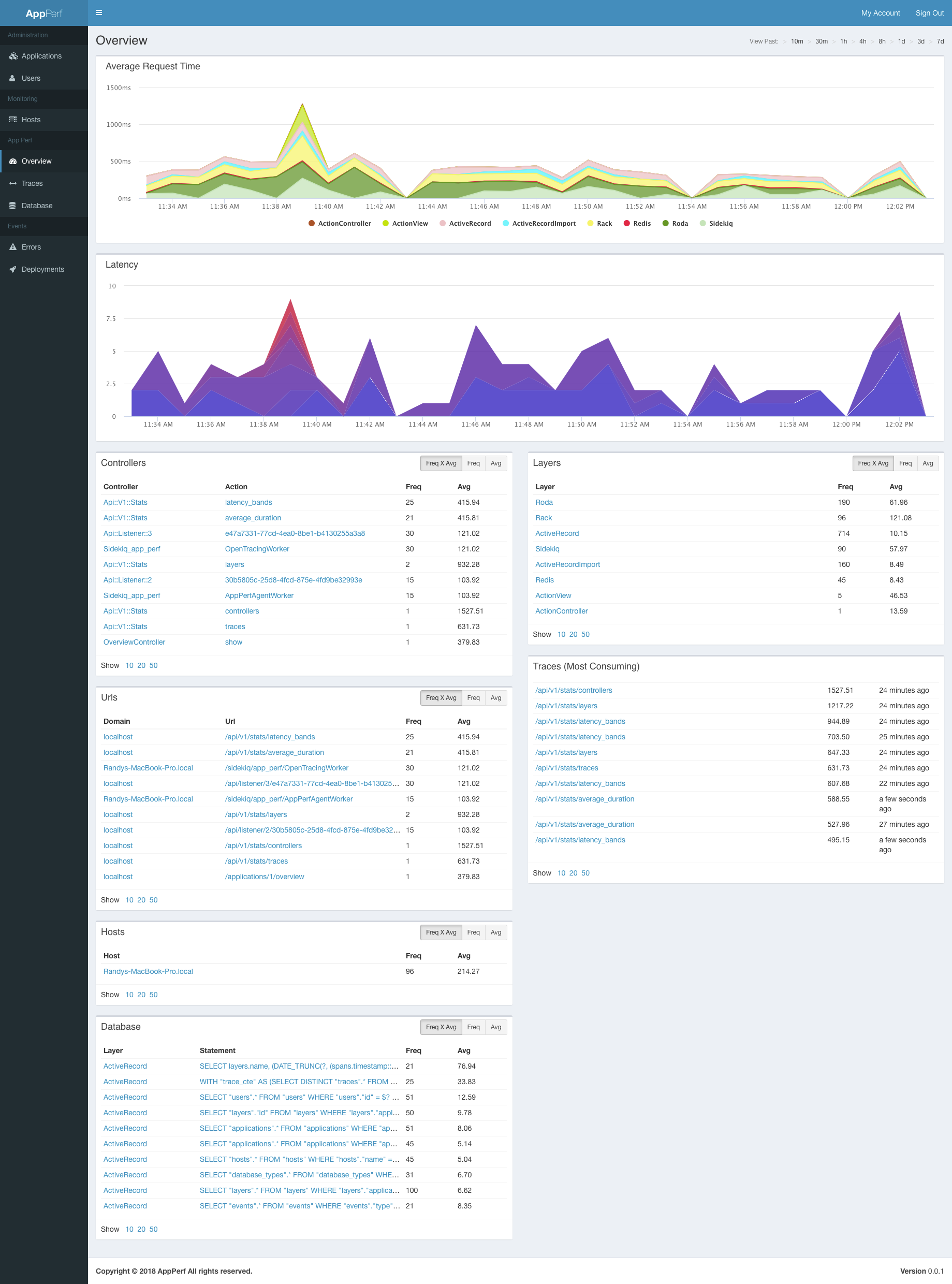
Now lets introduce the Latency Bands chart:
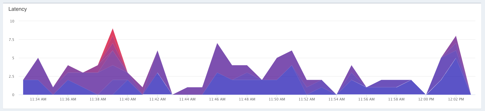
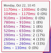
Quickly looking at this chart, you can see that something is going on at about 11:39 AM, as indicated by the red spike in there. The way this chart works is that it groups the latencies into 10 buckets based on their latencies. As the latency increases for that bucket, so does the color. The color range goes from blue to red, as more requests are grouped into each bucket. If you want to see the breakdown of the latencies, and how many requests there were, you can mouse over each data point and view the following:
Once you find a spike in your latency, you can then drag over that range to zoom in farther, and create a time scope that shows you what was going on with each of your components at that time. Hopefully this feature will allow you to identify more problems quickly, and determine how to fix them!
Shoot me some comments below if this was helpful!
Thanks